Procreate is my go-to painting app. This Procreate tutorial for iPad is all about mastering colour and light. The Procreate team is constantly improving the app and adding new features and Procreate is extremely fast and so far I haven’t suffered from lags while painting. I love to take the iPad out and about, and work in coffee shops. It’s fun to change your creative environment and leave your desk for a while.
If you’re exploring Procreate’s interface for the first time, don’t be fooled by its apparent simplicity (read our Procreate tips for more advice). It’s a very powerful tool for creating pro-level artwork. And remember, you can always save your painting as a PSD and put it in the cloud to continue working up in Photoshop. (These are the latest Creative Cloud deals or read our guide to the best digital art software for more options.)
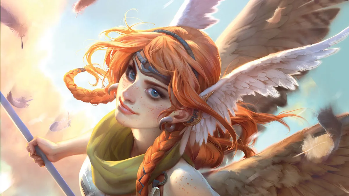
Here though, I’ll be painting the entire picture in Procreate. I’ll use much the same workflow that I use in Photoshop, with a few tweaks to take into account the lack of a Clipping mask in Procreate, but the app’s Selection tool makes for a straightforward workaround. I'll show you my step-by-step process, and you can scroll down to see the full artwork at the bottom of this page.

Jana Schirmer is a freelance digital artist from Berlin, Germany. An entirely self-taught artist, Jana currently works as part of the Marvel Studios' visual development team.
Procreate tutorial: make colours and lighting pop
I’ve been looking for a decent portable painting experience for years and I’m so happy that I’ve finally found one. (Read the Procreate review for a complete breakdown of what this Apple-exclusive painting app can do.) I hope you enjoy this workshop.
01. Coming up with the character and pose

As with any painting, I start by sketching the general idea. I try to make the character engaging to the viewer. I love using Procreate’s sketching brushes for this stage – they almost feel like real pencils. I’ve already created my own brush folder where I put all my favourite brushes that I’ll use for this image, so I’m ready to go.
02. Refining the sketch

My next step is to further develop the sketch. The line quality isn’t important at this point: all I need are some general guidelines for the painting stage later. I know I have to work up the face because this is what people usually pay the most attention to. Furthermore, I need to rein in her manga-like appearance slightly.
03. Moving on to colour block-ins

I fill in my selections using flat colours and the Hard Airbrush. This is my first painting step. Keeping all the important elements on different layers means I can select them easily, and makes for a more organised workflow. I try to use as few layers as possible, just to keep things manageable. Having said this, I’m not so strict with my hair layers, because I know I’ll be adding more strands of hair on their own layers later on in the painting process.
04. Choosing local colours

I lock the Transparency of the layers by swiping two fingers to the right on the layer. This means I can’t draw over my selection and can focus on the local colours. These are the colours an object has without taking light and shadows into consideration. I try to identify harmonious colours that won’t look over the top.
05. Time to consider the lighting in the scene

I want to put aside further rendering on the local colours and instead get a handle on the lighting setup. This is because I want to send the ImagineFX team another WIP (work in progress). I select one colour layer after the other and make a single selection on a new layer that contains the selection of all the colour layers that I talked about in step three. I fill it with a blue colour and set the layer mode to Multiply. Then I erase into that layer wherever I want the light to hit my figure.
06. Back to my local colours and ambient occlusion

Now that I’ve planned out my colours and the lighting setup, and both got approved, I can start rendering the local colours. I hide the light and shadow layer for now because I won’t need it for a while. I purely concentrate on rendering the local colours and ambient occlusion, because I want this image to work by itself, without the addition of light and shadow.
07. Working with the outlines

I use the Smudge tool to gently smooth the line-art. This makes the outlines less prominent and easier to work with, because my finished painting style doesn’t feature them. I rarely use Photoshop’s Smudge tool, but I love using it in Procreate. I advise trying all kinds of brushes for this. Some brushes are able to soften everything and some leave a nice texture in place. The Smudge tool can be used to develop all kinds of painterly effects.
08. Introducing more design elements

As you might expect, during the painting process I think of new things that I want to add to the illustration, such as the small pouch on the character’s belt or some details on her dress. If you’re unsure about any new elements, make sure you place them on a separate layer first. I also give her earrings and make the breastplate better fit her body. I would always recommend changing things or moving them around if you feel that something you’ve painted isn’t working.
09. Gather reference for the wings

I’m not happy with the shape of the wings and think I should have researched them more. Procreate has a great Transform tool, so I want to draw the wings from reference first and then transform them into the right position. I sketch the wings in a new file and copy-paste them into the main file. You can copy-paste objects by swiping down with three fingers on the canvas.
10. Perspective with ellipses

This image features an unusual perspective. I want to make her pose and the perspective as readable as possible, which is why I add straps and bands around her hand and legs. Elliptical objects are a good way to show what direction something is facing. I've found that if you depict an ellipse correctly, it'll make the perspective in the scene automatically more readable.
11. Redoing one of the legs

The leg nearest the viewer bothers me. The perspective seems off and I'm not happy with how I've painted it. Luckily, it's on its layer, so I drag it off to one side and paint in a replacement. I also ask my husband for advice, who comes up with some useful suggestions. It’s always great when there's someone around to give you honest feedback.
12. Refining the light and shadows

Now I finally return to the light and shadow layer that I introduced back in step five. I feel that the majority of the rendering is done and it's the lighting and shading which is missing from my illustration. Because the selection changed in some areas, like the leg, I have to reapply it on the image. I refine the layer and erase the parts again where the light hits the figure until I'm happy with it. Now I duplicate the shadow layer and drop it on every selection that I had before.
13. Last-minute changes

I decide to paint some loose feathers to give the image another dynamic element. My husband suggests adding a pattern to the wings, which now makes them look a little like owl wings. Certainly, they now look more interesting than simple, plain wings. This effect is easy to create on another layer in Multiply mode. I paint her freckles in the same manner.
14. Making some final adjustments
This is my favourite stage because it's my chance to make the image pop. I use a variety of layer modes and colour adjustments tools such as Curves to make the colours a little more vibrant. I tend to make my colours slightly dull and dark, because I work in the dark and my iPad is on a bright setting. That's why it's always good to check your final image on a monitor or calibrated laptop. And it’s done!

Procreate tutorial: secrets, tips and tricks
Here are a few extra ways you can get the most out of Procreate for your illustration work. These are my personal favourite shortcuts and need-to-know processes. (You can also read our advice on how to use Adobe Firefly to create custom Procreate brushes.)
Download the Handbook
Getting hold of a program’s manual might seem a bit of a no-brainer, but because Procreate regularly receives new and improved features, the manual is also updated by the Savage Interactive team. So be sure to get hold of the most recent version of the handbook, to pick up new tool tips and techniques.
Select multiple layers
If you swipe to the right on the layer you’ll be able to select multiple layers. This is useful if you want to make groups or if you want to select and transform something that’s on multiple layers!
Use Quick Select
My fave shortcut is to Quick Select whatever's on the layer. This is especially useful because Procreate doesn't have a Mask feature. Just keep holding two fingers on the layer that you want to select from, and you'll be able to stay on the current layer.
Get more Procreate tutorials in ImagineFX
This content originally appeared in ImagineFX magazine, the world's leading digital art and fantasy art magazine. ImagineFX is on sale in the UK, Europe, United States, Canada, Australia and more. Limited numbers of ImagineFX print editions are available for delivery from our online store (the shipping costs are included in all prices)
Alternatively, you can access us instantly through our digital options:
• Apple app (for iPad or iPhone)
• Pocket mags (multi-platform app, great for Android users)
• Zinio (multi-platform app for desktop or smartphone)